Others
5 Upcoming Web Design Trends for 2022
Here’s a great article from SitePoint
This sponsored article was created by our content partners, BAW Media. Thank you for supporting the partners who make SitePoint possible.
Web design trends don’t appear out of nowhere. They come in response to the actual needs that web users have at a given time. Those needs can address anything from making the exploring the web more useful, more enjoyable, or more comfortable.
When the world outside is undergoing changes that can make everyday life more difficult or less predictable, people look for stability and balance. That is what our world looks like at the moment, and the desire for a greater sense of stability and calmness is what we see reflected in web design trends of 2022.
Let us take a close-up look at five of these trends. As we do so, we’ll use a selection of BeTheme pre-built websites to illustrate what these trends involve. You can use them for inspiration or use them to rapidly and cost-effectively create or redesign sites for your clients.
If you design your clients’ websites with the latest web design trends, you’ll help them capture the attention of consumers looking for cutting-edge brands. Here are five new trends for 2022 you’ll want to be aware of and your clients will appreciate.
1. Immersive Image Design Can Inspire Consumers to Purchase More
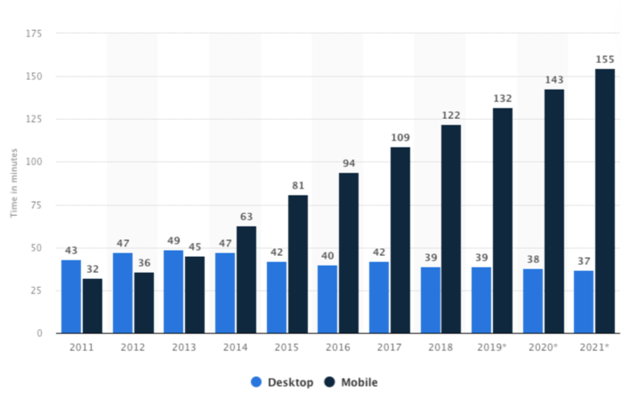
According to Statista — and as you may have noticed yourself — people all over the world spend more than 2½ hours every day on their smart phones, and another ½ hour at their desktop.

Some of this time is devoted to entertainment, and some is no doubt spent on conducting business or simply conversing with someone.
As for the rest of the time, it’s often spent looking for information on things to do outside of their screens, which could involve anything from looking for information to shopping for a product or service.
If you have or are building a website that sells a product or a real-world experience, you should be giving this some thought. The most effective way to sell something is to let the consumer “feel” it.
How do you do that?
With products, it’s not all difficult. Perhaps more so when hand-held devices are involved, but still not all that difficult. There are many ways you can display a product that will let a customer “feel” it.
An experience is a different story. In this case, a designer needs to create a digital environment that feels real to the observer. Here are two examples of how this is accomplished.
Many of BeTheme’s pre-built websites have been designed with this approach in mind. The BeCottage2 pre-built website uses an image blurring and filtering effect to blend the landscape images into the digital content.
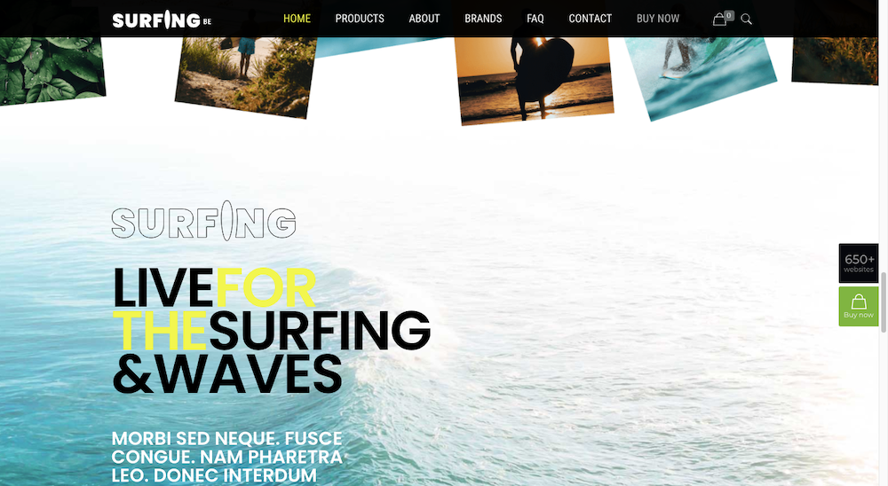
Surfing2 employs a similar strategy. In this example, the lightest part of the ocean image is blended seamlessly into the website background.

What the designer has accomplished here is to enable visitors to experience a smooth and easy flow from the digital content into a natural setting.
2. Changing Typography Draws Attention to Content
Changes in website typography size, color, and style are often employed to great effect as attention-getting strategies. In 2022, we’re going to see motion added to the text as well.
Motion in an otherwise quiet or still setting is always noticeable, and strategically placed and well-timed motion applied to content can really make a website stand out in the crowd.
Motion applied to text is a strategy that should be applied sparingly and applied only to text you want the visitor to take special note of.
BeDietShop does this effectively in its hero image by directing attention to the tasty food items.
BeEvent7 takes a different approach and uses motion to suggest the ticking of a clock.
You can put moving typography like that in this example in many ways. You can count up, you can count down, or you can count things like sales or charitable contributions.
Continue reading
5 Upcoming Web Design Trends for 2022
on SitePoint.
