Others
Accessible Web Design: How to Update Your Site for All Internet Users
Here’s a great article from Blog – WebFX
In this video, Jaci from the WebFX Interactive team explains how you can get started with accessible web design.
Transcript:
How would you feel if you were really excited to check out a website, but when you go to that website, you can’t access any of its content? I’d personally feel frustrated, and I imagine you would, too.
If you don’t use accessible web design, this is the scenario you create for one in four adults living with a disability in the U.S. That’s about 61 million people who don’t have equal access to your website.
Following web design accessibility guidelines isn’t easy if you’ve never done it before, but I’ll outline some things you can do to get started.
Use the timestamps in the video description if you’d like to skip to different sections of this video. Right now, I’ll dive into an overview of website accessibility.
What is website accessibility?
Website accessibility means that your website is designed so people with disabilities can use it. The goal of accessible design is to remove technological barriers so anyone can interact with your content.
According to the World Wide Web Consortium, also known as W3C, an accessible website works for people with auditory, cognitive, neurological, physical, speech, and visual disabilities.
Don’t worry if you’re not sure where to start. The W3C has documentation that tells you what your website should include to meet their standards.
This documentation includes:
- Authoring Tool Accessibility Guidelines (ATAG)
- Web Content Accessibility Guidelines (WCAG)
- User Agent Accessibility Guidelines (UAAG)
ATAG focuses on tools that people use to create Internet content and UAAG looks at the accessibility of tools that render web content.
I’ll focus on WCAG in this video, which are the guidelines for making website content accessible to everyone.
With WCAG, you have three different levels of compliance: A, AA, and AAA. As you go from A to AA to AAA, you follow more standards set forth by the WCAG and make your site accessible to a larger number of people.
So, how do you know if you have an accessible website? Do an audit!
How to audit your website accessibility
You don’t have to do an audit on your own. If you’d rather outsource your audit, get in touch with a team of consultants who can analyze your website and make any necessary adjustments for you.
Now, if you’d prefer to handle things in-house, you have plenty of options. You can comb through your website pages looking for issues manually, but this will probably take up a lot of your time.
You may want to use some tools to help you. Plug your URL into an accessibility checker like WAVE to see what you need to update on one page. You can also use a bulk accessibility checker to analyze multiple pages at once.
The W3C website has a big list of accessibility tools, so you don’t have to do everything on your own.
We also have a list of five important elements for your accessibility and some accessible design examples — which I’m going to talk about next—so stick with me.
5 web design accessibility guidelines
Just remember that these are short summaries of the WCAG guidelines. I’d encourage you to use the W3C’s quick reference guide to learn more in-depth techniques for accessible design.
1. Make sure text is readable
Any regular-sized text that communicates important information needs to be easy to read.
Contrast plays an important role in this. As it stands now, large text (like major headings) needs a 3:1 text to background contrast ratio. Regular (or smaller) text, like the text that makes up the body of your content, needs a 4.5:1 contrast ratio.
An example of too little contrast looks something like light green text on a slightly darker green background. Change the text to maybe black or white, and you have a lot more contrast on your website.
Users should also be able to zoom in on text in a way that doesn’t impact your site’s functionality or cause them to miss out on content.
2. Optimize images to be seen and read
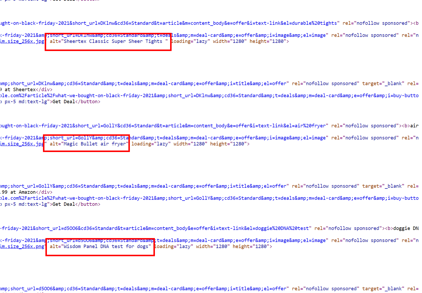
Adding alt text to images isn’t just a common SEO practice. It helps people who can’t see images understand what’s in them.
Alt text is a bit of text that clearly explains what’s going on in an image. The alt text fits right into your images’ embed codes. As you see in this example from Mashable, the page has images and when you flip to the code side of things, you see the alt text.

3. Give your audience additional ways to understand videos
If you’ve never added captions to your videos before, now is the time to start. And don’t just rely on the ones that YouTube or another hosting provider generates automatically.
If you have the time and patience, take a look at your auto-generated captions and make edits. They’re not going to be perfect coming from an AI.
You can also order captions using a tool like Rev and then add them to your video.
Including transcripts with your videos makes them more accessible. If you’ve written a script, you already have a transcript prepared!
Audio descriptions add another layer of accessibility. These are separate audio tracks that describe what’s going on in your video between gaps of dialogue.
So if you have two people talking about their recent shopping trip, and then the video cuts to some footage of a person trying on clothes, the audio description would explain what’s happening in the video. It may be something like this: A woman stands in front of a mirror and drapes two scarves over her shoulder.
A hosting platform like Wistia allows you to upload audio descriptions (and even has a video accessibility checklist when you upload your videos).
4. Design your website to be mouse and keyboard friendly
Not everyone uses a mouse to navigate the Internet. Your website should reflect that.
This not only means you have to ensure someone can interact with your website through a keyboard, but it also requires that you have noticeable ways to highlight what part of your website is in focus.
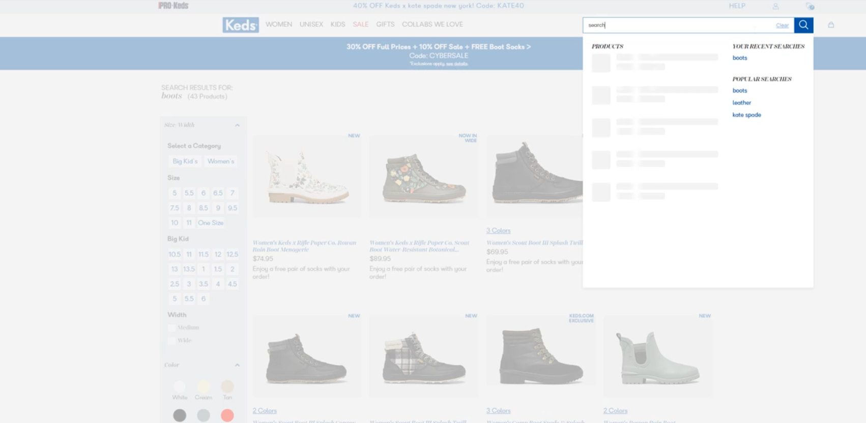
Looking at another of the accessible design examples, you see that when I click the search bar on the Keds website, the classic blinking line appears to let me know I can type. The search bar also becomes more prominent when clicked.

To meet the WCAG guidelines, this functionality should happen when a keyboard is used.
5. Make your site navigation easy to understand
This tip goes beyond accessibility. It’s just generally a good thing to make navigating your website simple and clear.
Write page titles and headings that have a clear purpose. Use link anchor text that makes it easy to understand what’s in the content you’re linking to.
Again, use focus indicators so people know where they are on a page. Offer more than one way to access a web page, such as through a sitemap, main navigation, or table of contents.
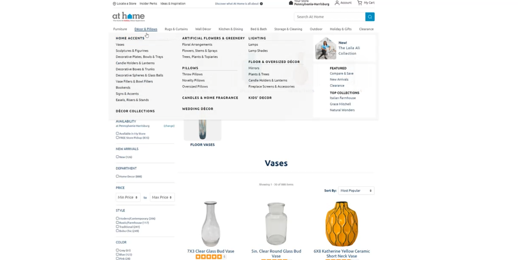
And how can I skip this one? Have consistent navigation. This means if you have a main navigation header, it really shouldn’t change when a user hops from page to page.
In this example featuring At Home’s website, though I’m clicking from one page to the next, the navigation at the top of the page does not change.

And as I said earlier, this is definitely not a comprehensive list of what you need to do to follow web design accessibility guidelines. These guidelines may change, too, so do your research when you’re ready to evaluate your accessibility.
To keep learning about different web design and digital marketing topics, subscribe to our YouTube channel and our email newsletter, Revenue Weekly. You won’t be disappointed.
Thanks for joining me!

Join the 1.5k+ marketers who get their marketing knowledge from WebFX videos.
The post Accessible Web Design: How to Update Your Site for All Internet Users appeared first on WebFX.
